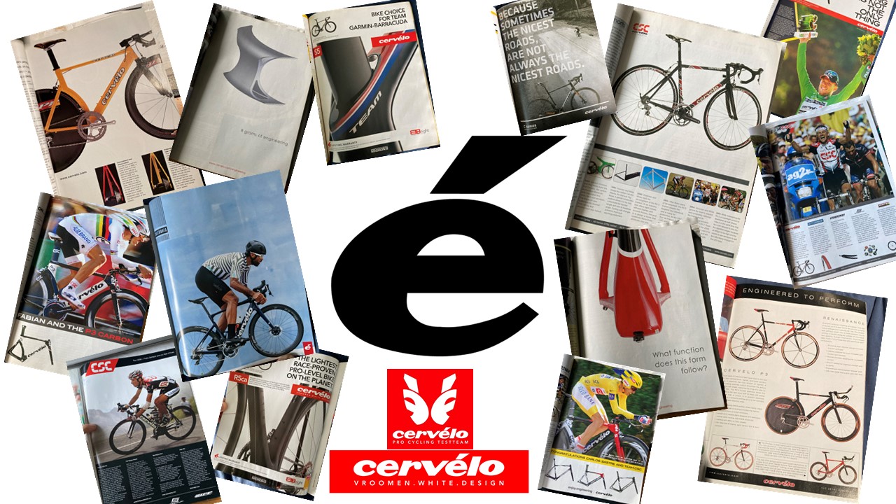
This is one of a series of upcoming looks at advertising in cycling, mostly informed by looking back through past issues of Procycling magazine.
We all love a good advert, don’t we? Those little snippets of language or imagery created with the sole intent to make us feel part of something, or to instil a desire to acquire, the best ones can become ingrained like a virus into our minds, a new brick in the ever taller world of pop culture, the worst follow their products to the ignominy of never being remembered. Whether by constant repetition during an interminable ad break or though the sheer brilliance of their creativity, they imbed themselves in our consciousness and influence our behaviour on a grand scale. These concentrated stories, condensed into an single page, video or phrase, permeate our lives with the simple intent of turning our attention.
Adverts are of particular importance to the world of cycling. This is a sport whose major events were birthed out of a need to sell newspapers, and whose participants are often described as “moving billboards”, their torsos plastered with the names of companies hoping that those by the side of the road or watching on TV will see have their heads turned enough by the technicolour spectacle to purchase something from them. Cycling is dependent on advertising – teams are funded (mostly) by companies hoping to use the exposure and success of their riders to return more revenue that their original investment. Thus, attaching yourself to a successful team or a particularly popular rider can pay, well, literal dividends in terms of bolstering the output of your sponsorship agreement.
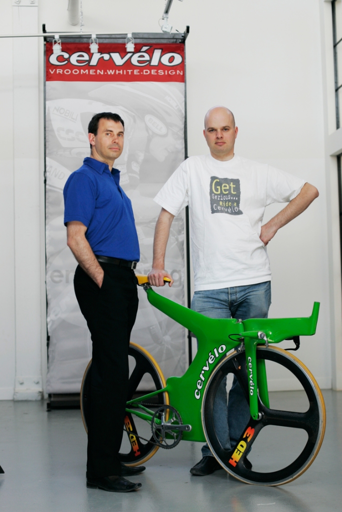
The traditional history states that Cervélo began in 1995, when Canadian Phil White and Dutchman Gerard Vroomen collided (not literally, I’m using artistic licence here…) in material composites lab at McGill University, in Montreal, Guebec. This was notable for the fact that Vroomen technically wasn’t even studying at the university – he was actually a mechanical engineering student at the Eindhoven University of Technology who was studying abroad at McGill in order to link up with a research group that was focusing on his passion – Human Powered Vehicles.
But “Cervélo” itself wasn’t actually born until sometime after March 1996, when, flicking through a dictionary, Vroomen stumbled across the Itallian for brain – cervello – and the French for bicycle – vélo – and combined them into a portmanteau, a “brainbike” that would fuse engineering knowledge and a fad free, visibly different approach that would become one of the most endearing names in 21st century cycling.
The history of Cervélo is fascinating, and the above and more can be found and explicated in much more interesting detail in the excellent To Make Riders Faster by Anne Dopico, who, spoiler alert, is married to Phil White, making her handy inside woman for the trials and tribulations of the brand. But I’m interested in the adverts – what did this young, unknown company from a country estranged from the Eurocentric world of cycling have to do to get noticed? How did they become mainstream, sitting under the legs of Tour de France winners, Olympic Champions, and conquerors of all the Monuments and World Championships?
Early Days – The plan
Cervélo came into being off the back of an engineering project for Gianni Bugno, the 1990 Giro Winner who had diversified into winning the Tour of Flanders and Milan San Remo, as well as two rainbow jerseys. Vroomen and White quickly developed a plan for their company, and in an inversion of how it had arguably been birthed, it was to be heavily focused on consumers and actually selling bikes to people, rather than on producing kit for professionals. As such, they came into the business with a plan and set of visions as to how Cervélo would proceed. They would ensure:
- An engineering approach versus a market approach
- Build what makes sense; don’t follow fads
- Unique and visibly different
- Frames that last for life
- Professionals ride exactly the same frames as consumers
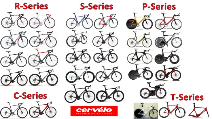
With that in mind, they set off with creating the foundations for the now famous R, S and P series.
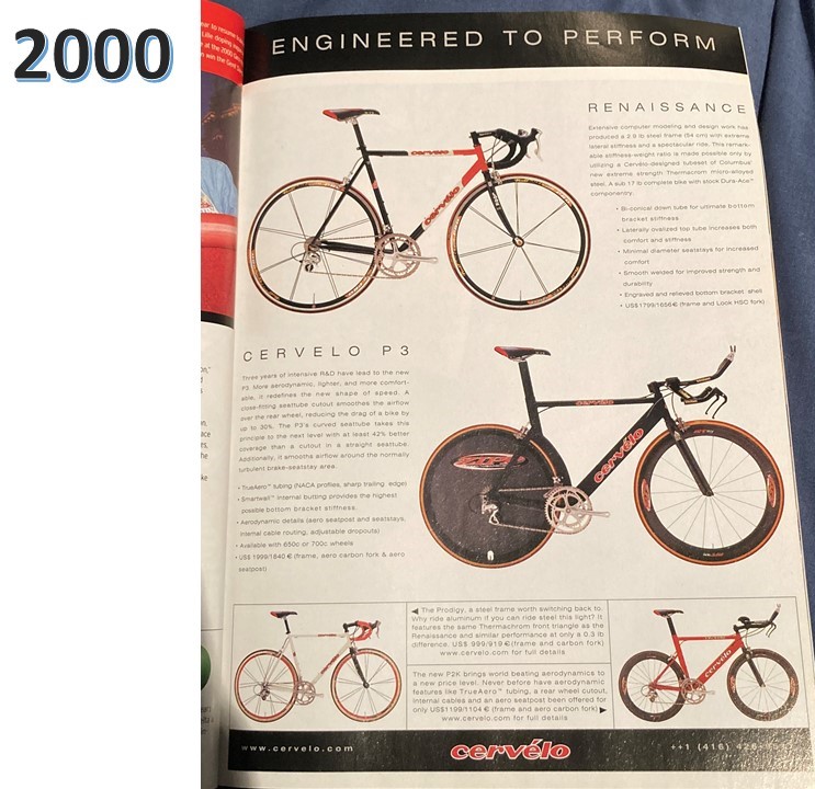
Procycling first featured an advert from Cervélo in 2000, where their familiar aerodynamic tube shapes were stressed in the explanatory blurb for their NACA profiles, as well as the “Smartwall” tubing designed to minimise weight and maximise stiffness. More notable however, was that despite the company being founded in a carbon fibre lab, non of the bikes on sale were actually composed of the wonder material that was taking over cycling. The Renaissance, for instance, whose name would presumably later lend its opening initial to the R-series, was a steel construction, whilst the P3, Progidy and P2K were all made of that much more modern material, aluminium. Even Cervélo acknowledged this but asking “why rider aluminium when you can ride steel this light?”
These were also the days when Cervélo didn’t produce their own branded forks, with True Temper, who now just make golf club shafts, providing the “Wolf” forks that were advertised for their aero carbon properties back when this was still a big deal. But it also seems Cervélo were ahead of their time, ith dropped seat stays and their famous curved seat post already preset and bragged about for its “42% better coverage than a cutout with a straight seat tube”, which isn’t exactly an aerodynamic piece of science, but the principle stands.
Overall though, it was clear that Cervélo’s advertising was to focus on this “Engineering first ” approach, hence the “Engineered to perform” title and many references to engineering terms and statistics.
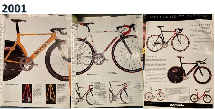
2001 saw Cervélo push their individual models slightly more exclusively, again in a “white paper” style with box outs emphasising the engineering behind the at the time unconventional designs. Cervélo still seemed not to necessarily have the data to back up their claims, instead suggesting that “many similar looking cut outs aren’t nearly as effective.”
The Progidy did use Cervélo’s own fork, and was described as a “no expense spared” model despite being heavier than its steel Renaissance cousin, termed a “fusion of math and myth” weighing 1.3kg for the frame, which would be termed positively obese by current standards (in 2013, Cervélo produced the R5ca, with a frame of just 667g). Unlike many other ad campaigns, Cervélo’s was novel in that in many, they did not actually use their logo, instead using the frame as the focal point (given it of course has the company name emblazoned across it), and when they did use it, it appeared only at the bottom in relatively small print. In other words, it was the bike, rather than the brand, that was to be the star.
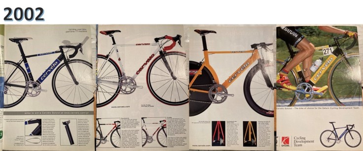
2002 saw the introduction of the brand’s second, and indeed probably the world’s second aerodynamic road bike with the Soloist, which, as the name suggests, was intended to help breakaway specialists power away with minimal drag from the wind (the first aerodynamic frame was also a Cervélo, the 1996 Eyre). As Cervélo put it, it was for “the aggressive rider who likes to ride alone.” Perhaps unsure if people would really want an aerodynamic road bike, the advert used some shadowing to point out that with some aerobars and a reversible seatpost, the Soloist could readily become a time trial bike for the discerning tester or triathlete.
The Soloist was still made from aluminium, and Cervélo were keen to emphasise two particular points: one, that it feature an aerodynamic teardrop shape downtube and seattube, and two, that it was bein used by the Saturn Cycling Development team. This latter element fitted in with the original brand aims that professionals would ride the same bikes as professionals, although obviously they needed to actually get the bikes under some professionals to be able to say that. Saturn had some impressive US cycling alumni, although its unclear if the likes of Chris Horner and Tom Danielson actually road the Canadian machines as I can figure out if Saturn Cycling Development Team is different from the Saturn Cycling Team, which is listed as using Lemond bikes during this time.
Also notable is that 2002 saw Cervélo begin to use the “é” as a brand trade mark, rather than “Cervélo” in full as brand recognition began to take hold: they not only added it to the seat tube of the Soloist, but also as the logo in the Saturn themed ad.
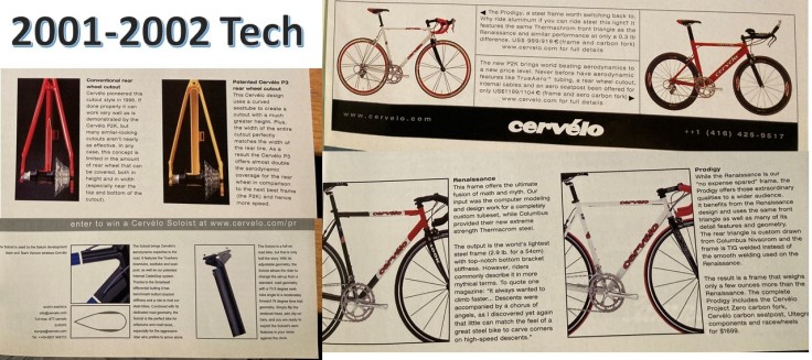
A slightly closer look at the “tech” boxes that Cervélo added to the bottom of the ads, explaining their curved seat post ideas, reversible seatposts, Smartwall tech, teardrop profiling, and the Renaissance, Progidy and P2K models.
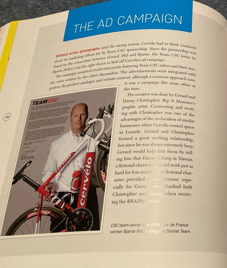
Meanwhile, during 2002, the 1996 Tour winner Bjarne Riis had been looking for a new bike sponsor for his CSC-Tiscali team to replace French company Look, and he decided he liked the approach of Cervélo and so signed up the relatively fledgling company to the ProTour, which was essentially like the brand being promoted from the National League to the Premier League, requiring an upscaling of production capabilities to supply enough machines for the Danish registered team to use.
As this excerpt from “To Make Riders Faster” tells, the two groups joined forces to begin and add campaign that would run for a few years, whereby CSC and Cervelo would advertise as a unit, with the team emphasising the various componentry used and the successes of the squad using them – both promoting the team and the sponsors behind them.
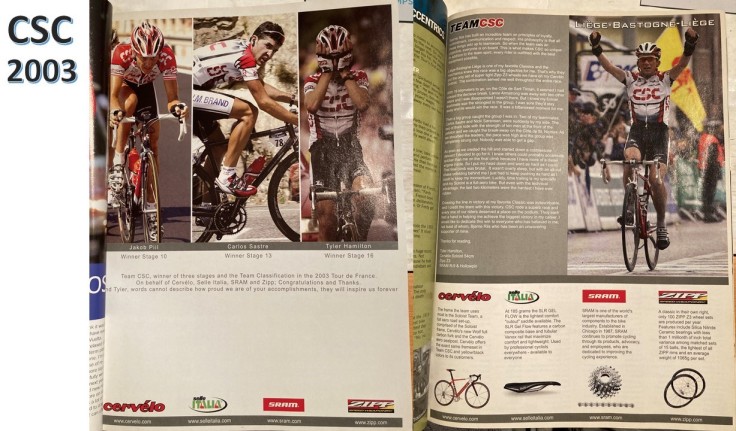
Having initially just had to work with pictures of Riis with a bike, once racing got underway, Cervélo were able to utilise the race photography of the season to showcase how their bikes had triumphed. The Centernary Tour de France was clearly a great place to start, and CSC won three stages through Jakob Piil, Carlos Sastre and Tyler Hamilton. The image of Sastre is sneakily cropped to avoid showing the Time fork the Spaniard was using, and the frame he was using was novel for not featuring any Cervélo branding. Well, a slight lie – it did have a “é” on the headtube, and the text on the down tube is the legend “Vroomen White Design”.
Hamilton also featured in another ad after winning Liege Bastogne Liege, which took the form of a letter written by him that was a mixture of thanking the team, exploring how the endgame of the race had played out, and name checking the sponsors who had provided the steed he rode to victory. It’s important to note that SRAM at this point were just a component manufacturer, mainly making cassettes, rather than the full groupsets for which they are now known.
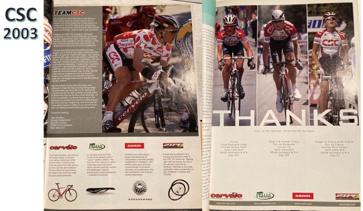
Hamilton continued to feature in 2003, and the team even gave him a send off to Phonak with a list of his best victories for the team, again listing which variants of their products had been used. It was clever marketing – providing a shopping list for a variety of terrains and situations as to what equipment was ideal.
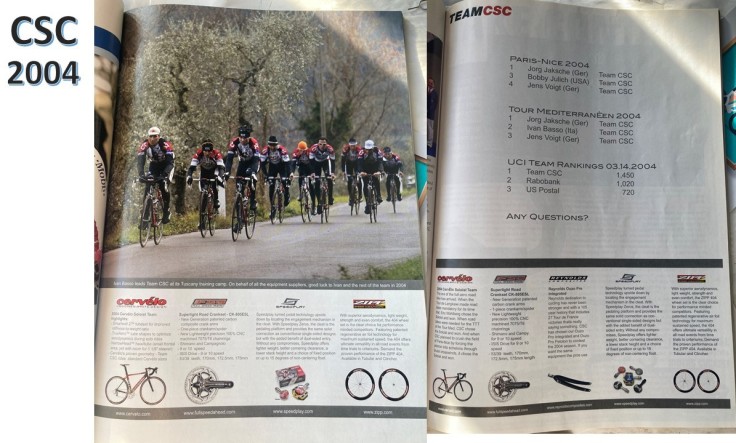
Shorn of Hamilton, 2004 saw a slight shift to pointing out the results that the team had achieved, as well as extolling the virtues of some of their new sponsors, such as FSA, Speedplay, and Reynolds, who now supplied the forks. Whether the advert would have been approved by today’s advertising standards committee is dubious, given its sneaky way of representing the results of Paris Nice to make it look like the team had swept the podium – Davide Rebellin had in fact split Jaksche and Julich, but the team simply omitted the Italian’s name for a cleaner look.
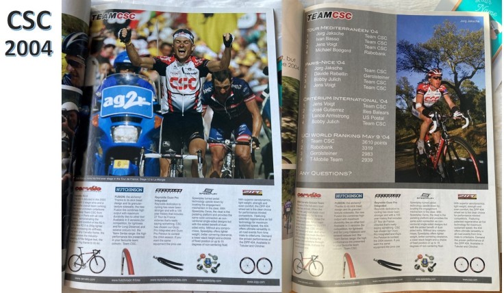
By the end of the year though, the “brochure” advert template was well established, and was riding high on having Ivan Basso ride to third at the Tour. Any advert featuring Lance Armstrong would go down well even if he wasn’t actually involved with the brand, but having someone on your material beating him on his “home” turf was obviously going to be an attention grabber. Elsewhere, the team added Hutchinson tyres as a sponsor and did add in the non-CSC riders into the results, although again, it always helps if one is Armstrong.
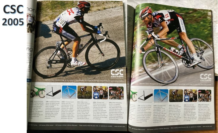
2005 saw the focus shift away from CSC as a team and more towards Cervélo and their heritage, explaining how brand had progressed from their radical Barrachi for Bugno through CFD and other dodgy looking creations to be under Tour contender Ivan Basso. That a company less than a decade old was now boasting of its history was quite bold, although perhaps that was the point – that they had come such a long way in such a short period of time.
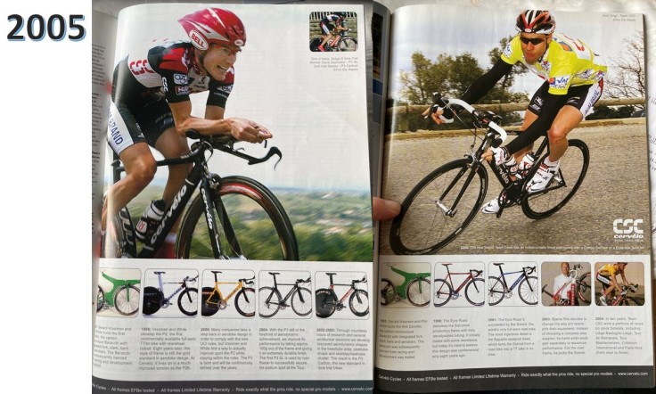
More images from 2005, featuring Dave Zabriske, who had an inset image of Ivan Basso to try and point out that Cervélo did indeed make a Carbon Timetrial bike, the P3C, as well as the aluminium P3SL that Zabriske was pictured riding. Jens Voigt was also pictured on a Soloist AL, as the bottom images became a timeline of the innovations that the brand had made over the years, extolling how they had pushed forward whilst other teams had fallen back to try and keep their machines within the UCI regulations.
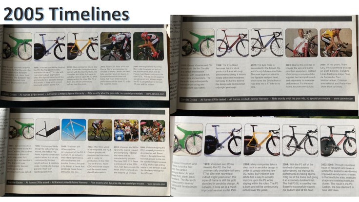
A closer look at the “timelines” used by the ads, with readable text.
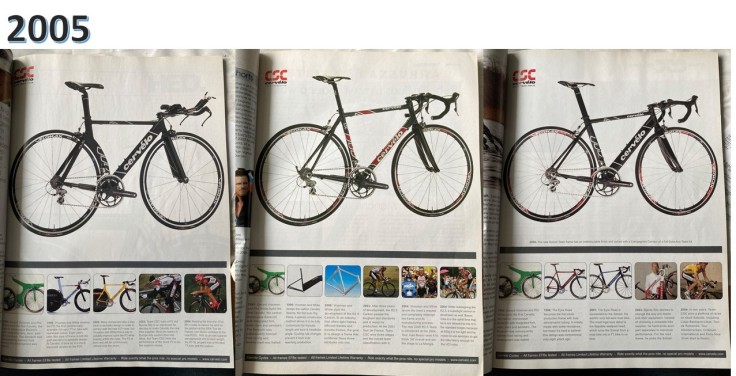
It wasn’t all a celebration of the CSC partnership however. Cervélo were also keen to promote the bikes themselves, which had a rather unique aesthetic in the day both in their shape and paint schemes. The wrap around seattube was essentially a Cervélo signature, although the R2.5 (yes, they actually called it that) actually resembled a Colnago with its lugged tubes, and did not yet feature the skinny seatstays that would define the R3, featuring a wishbone design instead.
The CSC connection was evident in the paint job, which featured the “eagle” wing design adopted by Riis on account of the nickname which had been initially crafted as a mocking rebuke of his abilities – the Eagle from Herning – that he had actually embraced.
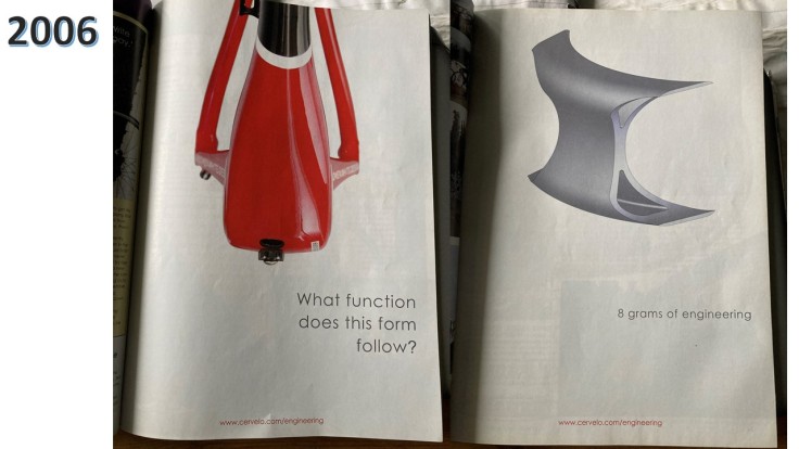
“We apologise in advance if our ads look like they’re written by engineers. We figure you would rather read and add designed by an Engineer than ride a bike designed by a marketing department.” A fair quote from Gerard and Phil, except that in 2006 they almost abandoned words altogether with this highly minimalist attempt at marketing by stealth, which worked by showing one of the key components or recognisable aspects of a Cervélo and prompting the reader to investigate further on their website. With no logo, the ads showed that Cervélo were now so embedded in the consciousness that they could simply show a silhouette or even just talk about engineering, and the public would immediately know what brand was being advertised.
The engineering page still exists, out of interest, albeit not the historical versions about eight grams of engineering and all that, which sadly doesn’t even feature on the Wayback Machine.
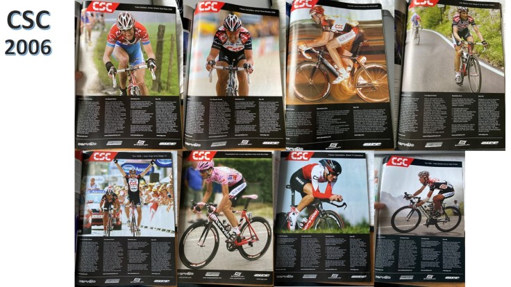
2006 was arguably an absolutely classic season for CSC, who had a stellar squad assembled with Frank Schleck, Ivan Basso, Fabian Cancellara, Jens Voigt, Bobby Julich, Stuart O’Grady and Carlos Sastre. As such, the adverts revered back to being CSC focused, with each featuring a particular performance by a CSC rider whilst highlighting the materials from Cervélo, FSA, Speedplay and Zipp had had aided them. And so a stage win on Alpe d’Huez, Amstel Gold Race, Paris Roubaix, Jen’s Tour break and Basso’s Giro triumph were used to demonstrate the prowess of Cervélo’s range across all terrains and disciplines.
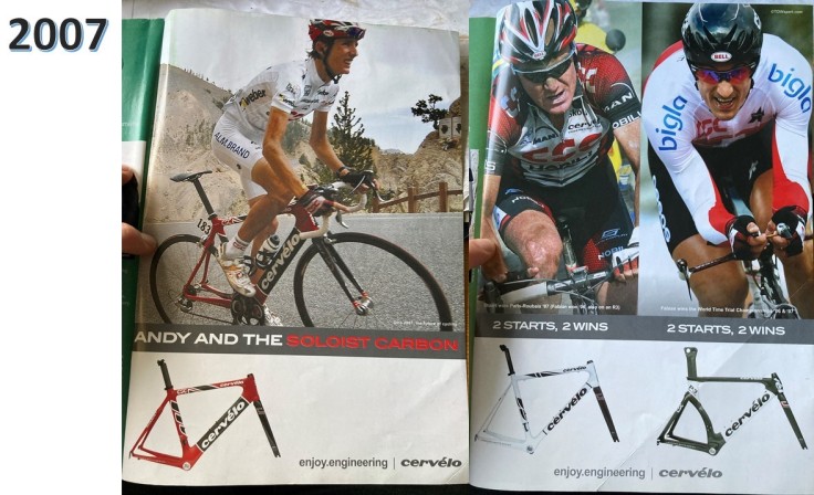
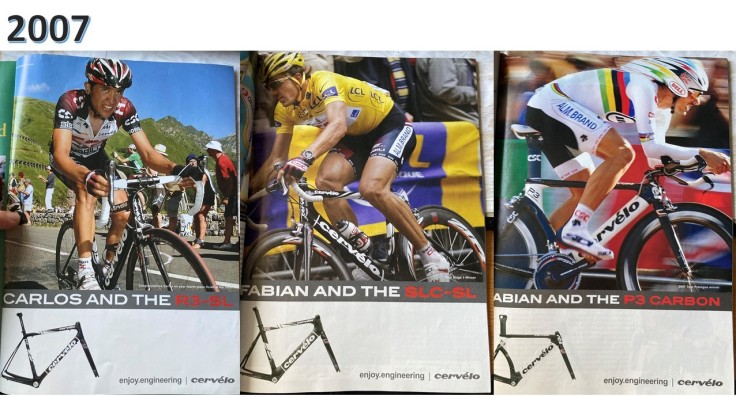
Seemingly alternating, 2007 was a return to Cervélo themselves, and more of an explicit focus on the aforementioned varieties of terrain and disciplines that road cycling demands. They could also count on having star riders who could be known mononymously on their books, so it was almost personal to introduce readers to “Andy, Fabian, and Carlos.” This was arguably the peak year for Cervelo in terms of results, exposure, and the aesthetics of their machines, with their black, white and red paint schemes achingly cool whilst the R and Soloist lines were becoming more distinct identities.
There was even a clever new motto, “Enjoy. Engineering”, which emphasised both the joy that riding the machine would bring as well as the scientific foundation of the ride. To ride a Cervélo was to enjoy engineering to its fullest indeed.
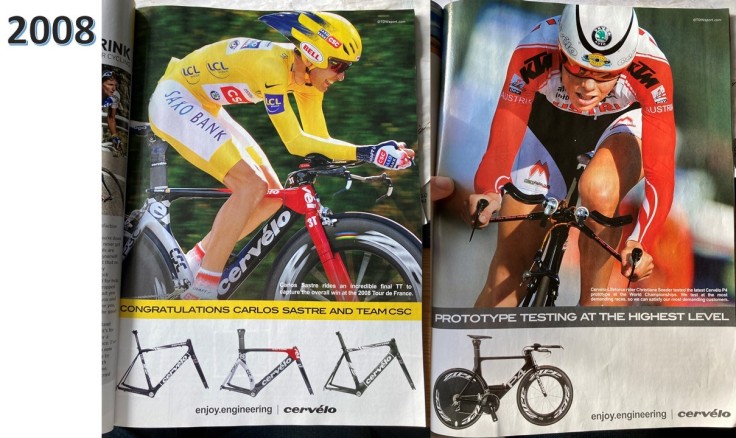
Arguably the pinnacle of Cervélo’s sporting history, a barnstorming Tour de France saw Carlos Sastre usurp the presumed hierarchy of the Schleck’s and claim the yellow jersey, winning a stage on Alpe d’Huez on an R3-SL to boot. A Tour win was obviously an excellent advertising opportunity, and Cervélo were happy to take advantage.
A taste of what was to come the following year was shown in their advert for the new P4, a more radical TT bike built around its integrated hydration solution and hidden rear brake (it’s weird to look at these days, when brakes under the bottom bracket have been mostly abandoned and the P4s front end would cause many testers to throw up with its rats nest of exposed wires). Not only did the ad feature Christiane Soeder, the first woman in one of their ads, but it focused on “prototype testing at the highest level”, a concept that would be elevated to the highest level in 2009 with the creation of the Cervélo Test Teams.
2009 & 2010: The Cervelo TestTeams
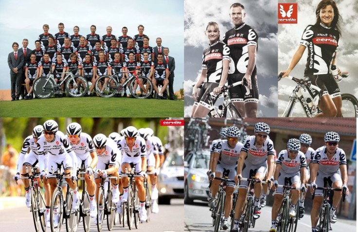
The years at the turn of the decade saw Cervélo adverts disappear from the pages of ProCycling and indeed other cycling publications, but with good reason – the marketing budget had cleary been subsumed into the budget for the new “TestTeam”, which was born out of CSC-Saxo Bank’s decision to move to Specialized. The TestTeam was never really meant to be branded as such – it was meant to be a holding name until a suitable sponsor could be found, but the 2008 Financial crisis had meant that companies were not exactly flush with cash with which to take a hedge on a newly formed cycling squad. Cervélo made the best of a bad situation however – signing up the reigning Tour de France Champion Carlos Sastre, Kristin Armstrong and Emma Pooley (the TestTeam had both male and female teams, rather ahead of their time) and declaring their intent to focus on utilising the best athletes in the world to help develop their products.
With a YouTube series “Beyond the Peloton” documenting their progress, a hyper-cool set of kits and massive exposure as the team set about winnig right from the off, Cervélo also pulled off something of a marketing masterstroke with Castelli, their clothing manufacturer, with the advent of “Tour de France change kit.” Whilst these had been done before, they were traditionally either because the team’s colours clashed with the leader’s malliot jaune or as a celebration of the winner on the final stage. Cervélo’s excuse was that a white kit rather than a black kit would be better for the summer months, but it was oh so Euro and beautiful that they continued using it for the rest of the season. The Castelli kits, also the first to have an aero fit for a road race, would become classics, if only for their oh-too-short featuring in the peloton.
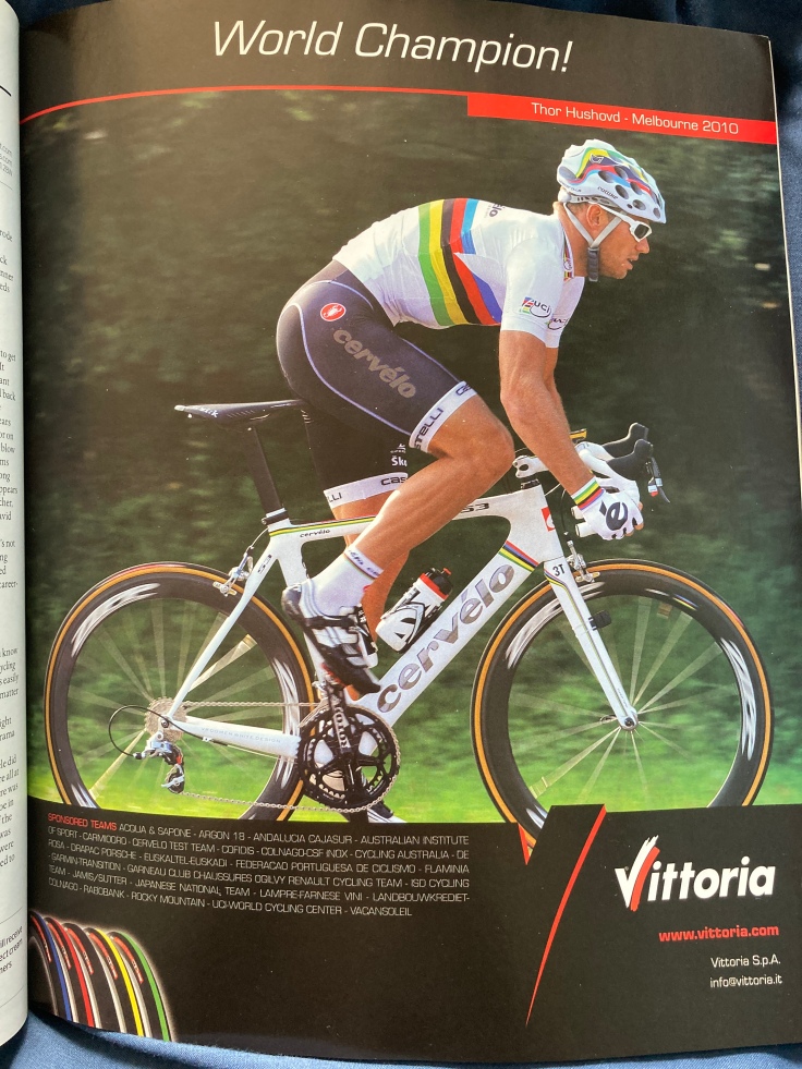
For by the end of 2010, the TestTeam could go no further. Running a cycling team is an expensive business, and the team were still struggling to find sponsors. They secured Tata Consultancy Services for the 2010 Tour, but no one was willing to commit to to keep the team together despite Thor Hushovd’s World Championship victory, giving them an opportunity to have their logo on the rainbow jersey, which was a great shame. And so whilst the women’s team became Garmin-Cervelo in its entirety, the male TestTeam was dissolved, with those under contract being lumped into the Garmin-Cervelo team run by Jonathan Vaughters.
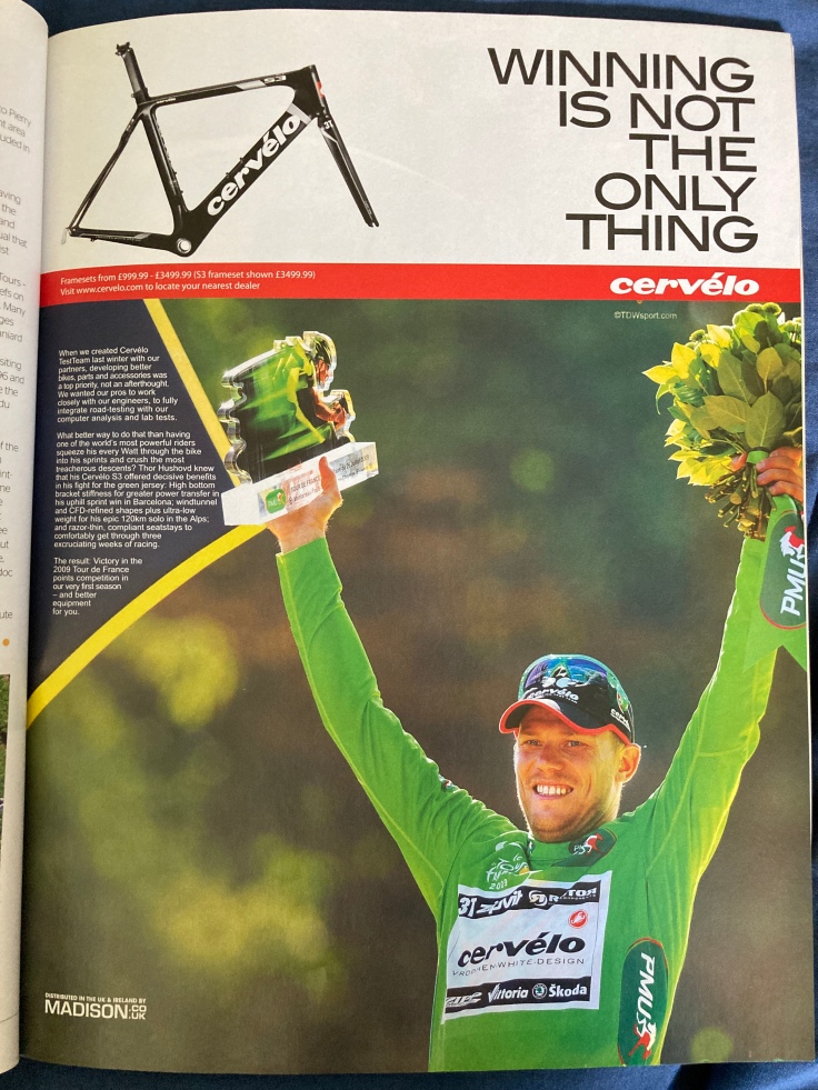
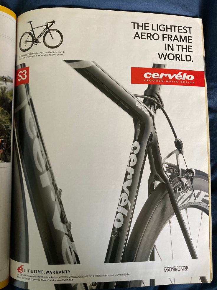
Cervélo did manage to get their team into print briefly, harking back to the rider focused ads of the CSC era with Thor Hushovd’s green jersey win, albeit without Thor having actualy written the piece. Cervelo had changed their naming conventions so that seemingly ever model was a 3 or a 5, after the P4 had faced the wrath of the UCI. So we had a P3, R3, and S3, soon to be followed by an R5, S5 and P5.
World Championship issues…
No discussion of Cervelo’s advertising can be complete without noting the horror of what they did when Emma Pooley and Thor Husovd won world titles in Melbourne in 2010. A back to back photoshoot between two people with a 25cm height difference was debatable anyway, but then Cervélo somehow committed the cardinal sin of managing to get the order, and indeed the colour tone, of the rainbow stripes incorrect:
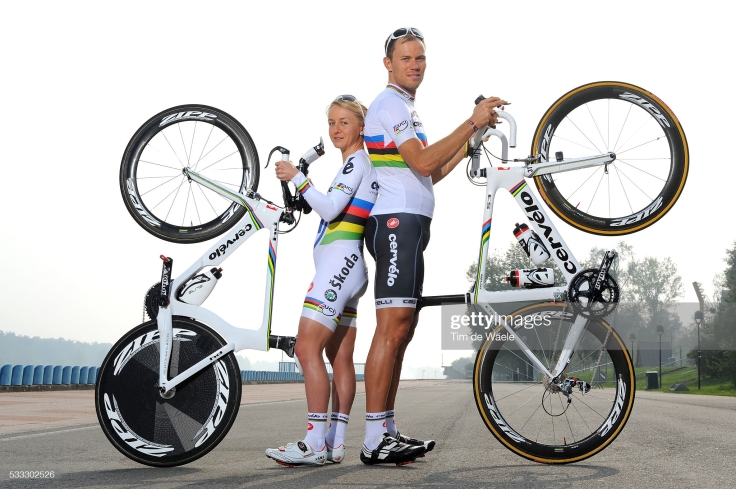
It’s Blue then red, not red than blue, you rotters. But then you can’t blame them entirely – Tyre manufacturer Vittoria ran an ad from the same shoot where they didn’t photoshop out the wrong colouring:
I swear I’ve seen examples elsewhere where the colours had been photoshopped the correct way around, but for the moment, they escape me.
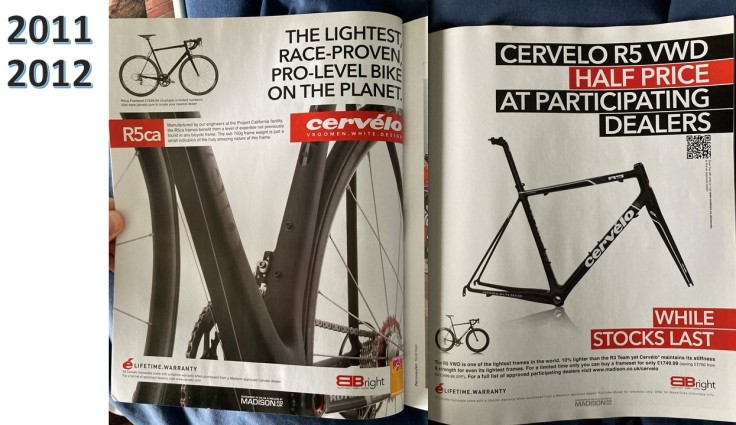
This meant that Cervélo returned to print advertising, having implemented a new hierarchy in their models. Rather than their just being a stand out R5 for example, there was now an R5, an R5 Team and an R5 VWD – Vroomen White Design – which would mark out a higher quality machine, crafted with a different blend of carbon fibre to make the frame lighter.
They’d also unleashed the S5 on the world, a bike whose, er, unique aesthetics weren’t entirely appreciated by everyone, and so perhaps chose not to show the whole thing to potential buyers but rather drip feed it to them in the hope they would become acclimatised to its bizarre collection of curves and lines.
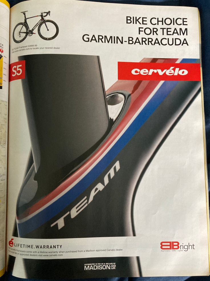
BBright was Cervélo’s proprietory bottom bracket shell design, which meant an asymetric design to ensure a stiffer, lighter, more efficient heart of their frames. Like all bottom bracket standards, it was fairly controversial, but they were happy to splash it across the pages.
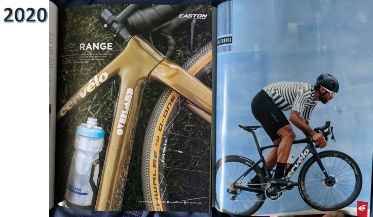
For whatever reason, Cervélo didn’t bother with advertising in ProCycling for a few years, during which Vroomen and White effectively left the company, it was sold, and gravel bikes became a thing. It was this that prompted the return of Cervélo ads, again using just the é as their logo, to introduce the world to their “C” series, which admittedly didn’t last very long as it quickly just became the Caledonia and the Aspero. As the ad on the left here shows, thye were also at least being featured in other manfacturer’s ads, in this case, Wheel manufacturer Easton.
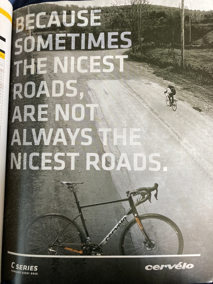
Yep, the short lived C-Series, heralded as the C5, is now essentially the Caledonia, as this RS looking model looks somewhat different to what the Aspero turned out to be. Also worth noting is that the logo no longer carris “Vroomen White Design” due to the departure of the founders.
It will be interesting to see if Cervélo returns to featuring athletes in its ads though, given it now has its frames under the likes of Primoz Roglic and Wout Van Aert as part of their team up with Jumbo Visma. Can they really afford to let the chance to sell bikes off a Tour de France win (fingers crossed) pass?!

Leave a comment